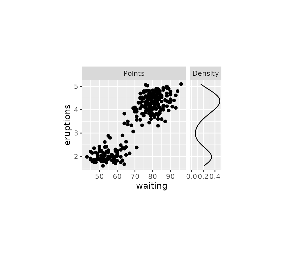
The ggh4x package has some extended options for tweaking the appearance of facets.
Extended facets
This package offers two extensions to the vanilla
facet_wrap() and facet_grid() that give you
more control of the placement of axes at the inner facets.
Wrap
The default behaviour of facet_wrap2() is to replicate
exactly what ggplot2::facet_wrap() does.
# Make a standard plot
p <- ggplot(mpg, aes(displ, hwy, colour = as.factor(cyl))) + geom_point() +
  labs(x = "Engine displacement", y = "Highway miles per gallon") +
  guides(colour = "none")

p + facet_wrap2(vars(class))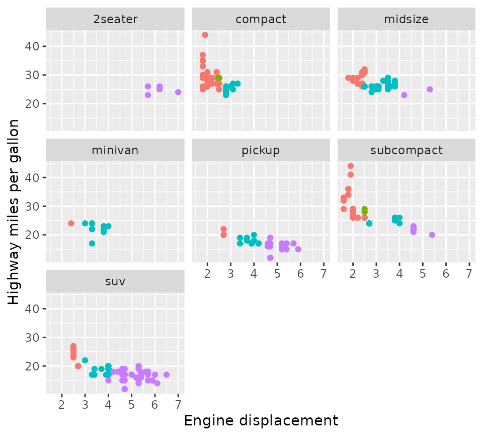
The difference is even when scales = "fixed" (the
default), you can draw the axes at (some or all) inner facets with the
axes argument. Moreover, you can choose to omit the axis
labels but keep the axis ticks of the inner facets by setting the
remove_labels argument.
p + facet_wrap2(vars(class), axes = "all", remove_labels = "x")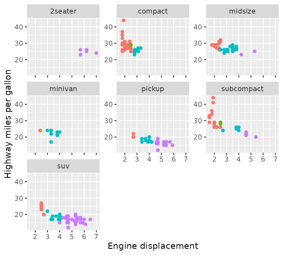
Another nicety is that you can force an exact number of rows and columns.
p + facet_wrap2(vars(class), nrow = 4, ncol = 4, trim_blank = FALSE)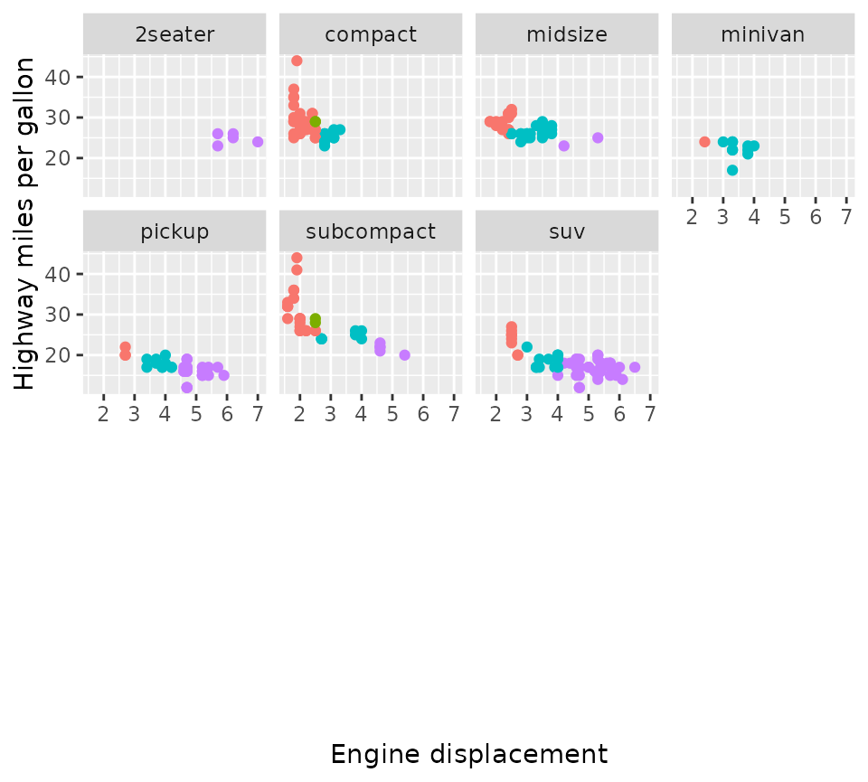
Grid
Likewise, facet_grid2() is based on
ggplot2::facet_grid() and by default behaves identically,
but also supports the extended options for axes that
facet_wrap2() has.
p + facet_grid2(vars(year), vars(drv), axes = "all", remove_labels = "y")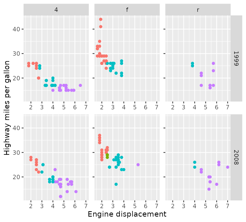
In addition, facet_grid2() also supports what the
package calls ‘independent’ scales. This relieves the constraint that
ggplot2::facet_grid() has that a scale can only be free
between rows and columns of the layout, and instead allows scales to be
free within rows and columns of the layout. This keeps the grid layout
but preserves the flexibility of scales in wrapped facets. Notice that
in the plot below, the x-axes are independent for each panel.
p + facet_grid2(vars(year), vars(drv), scales = "free_x", independent = "x")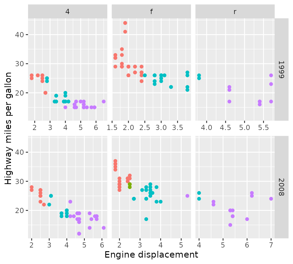
One sacrifice that had to be made for independent scales, is that
facet_grid2() cannot have independent scales and
have space = "free" for the independent dimensions. You can
however combine these in different dimensions.
p + facet_grid2(vars(year), vars(drv),
                scales = "free", independent = "y", space = "free_x")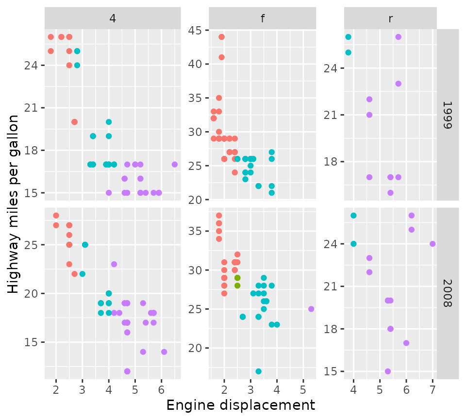
Lastly, the render_empty argument can be used to
not display empty panels in cases where the rows
and cols describe an intersection that may be empty.
p + facet_grid2(vars(drv), vars(cyl), render_empty = FALSE)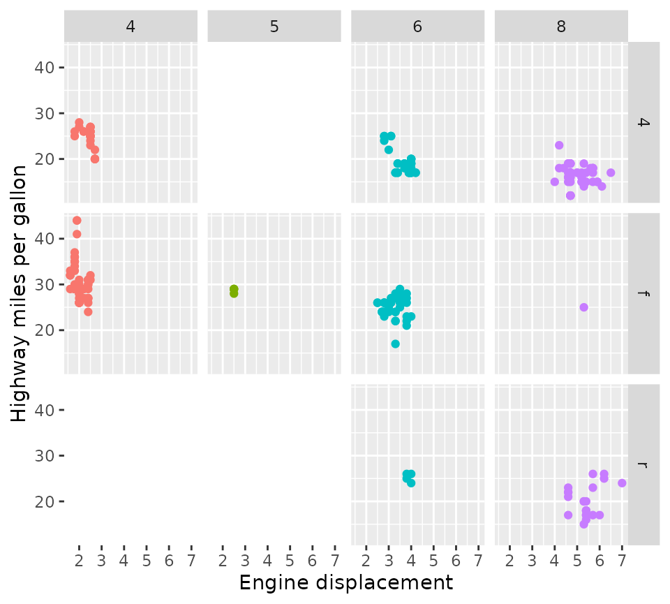
Nested facets
Perhaps this package might be best known for generating nested facets; wherein outer strips can span inner strips if they belong the the same category. This can be especially useful if there is some hierarchical relations to the facets.
In the example below, we’ll categorise the Iris species for having long or short leaves.
new_iris <- transform(
  iris,
  Nester = ifelse(Species == "setosa", "Short Leaves", "Long Leaves")
)

iris_plot <- ggplot(new_iris, aes(Sepal.Width, Sepal.Length)) +
  geom_point()

iris_plot +
  facet_nested(~ Nester + Species)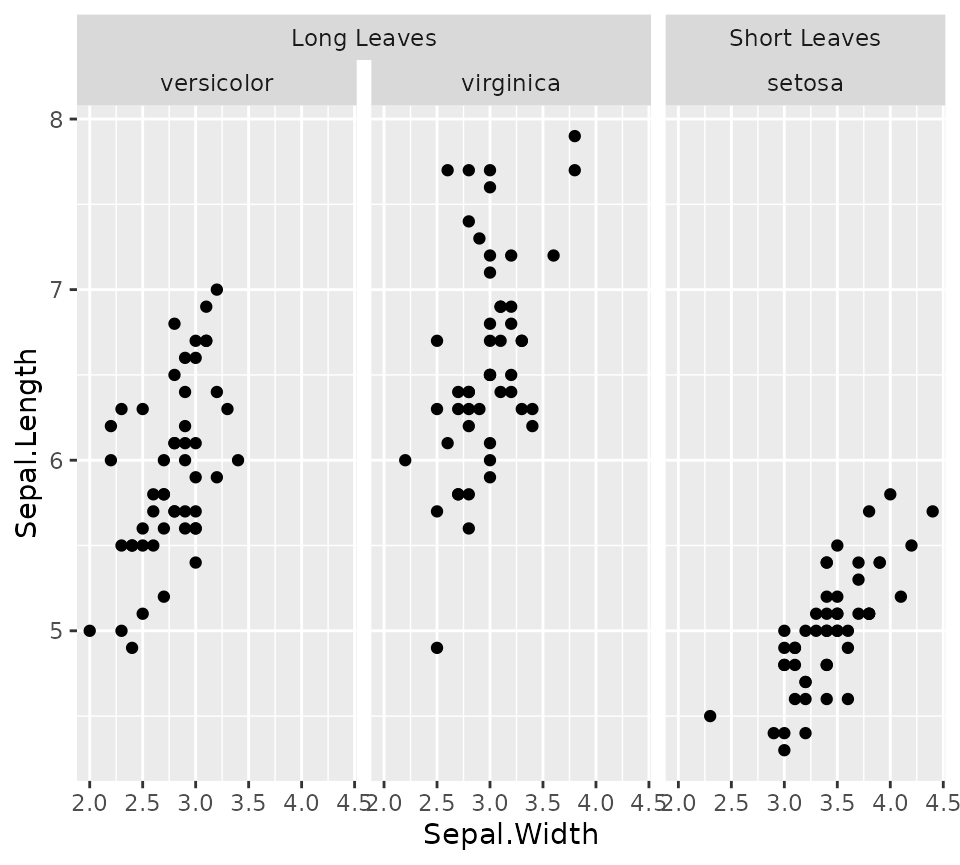
Nesting lines
If you prefer your strips to have blank backgrounds, you could still
indicate the hierarchical nature by setting
nest_line = elment_line(). The appearance of the line is
inherited from the theme element ggh4x.facet.nestline. In
the example below, the nesting line is dotted because the given element
has linetype = 2, but is also blue because it inherits from
the theme element.
iris_plot +
  facet_nested(~ Nester + Species, nest_line = element_line(linetype = 2)) +
  theme(strip.background = element_blank(),
        ggh4x.facet.nestline = element_line(colour = "blue"))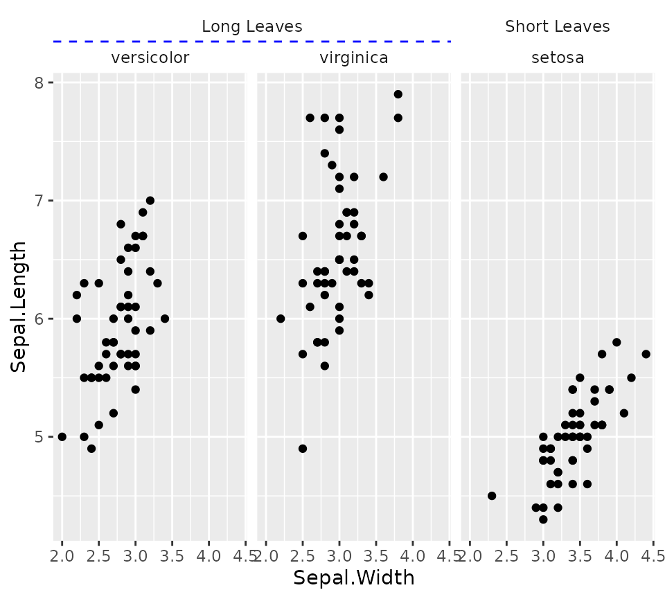
Please note that the ‘Short Leaves’/‘setosa’ strips are not separated
by a nesting line. You can turn on the nesting line between such strips
by using the facet_nested(..., solo_line = TRUE)
argument.
Relation to facet_grid()
While facet_nested() is based on
facet_grid()), there are a few differences. First,
facet_nested() inherits from facet_grid2(), so
that it inherits the axis features. More notably,
facet_nested() doesn’t require input data to have
all the facet variables. In the example below, we remove the
Species column, to prevent facetting on that variable. Note
that if we didn’t specify a new Nester variable, it would
put the second set of points in all panels, just like
facet_grid().
Furthermore, when strips are placed at the bottom, it rearranges the strips so that the inner strips are closest to the panels and spanning strips are furthest from the panel.
iris_plot +
  geom_point(data = ~ transform(.x, Species = NULL, Nester = "All")) +
  facet_nested(~ Nester + Species, switch = "x")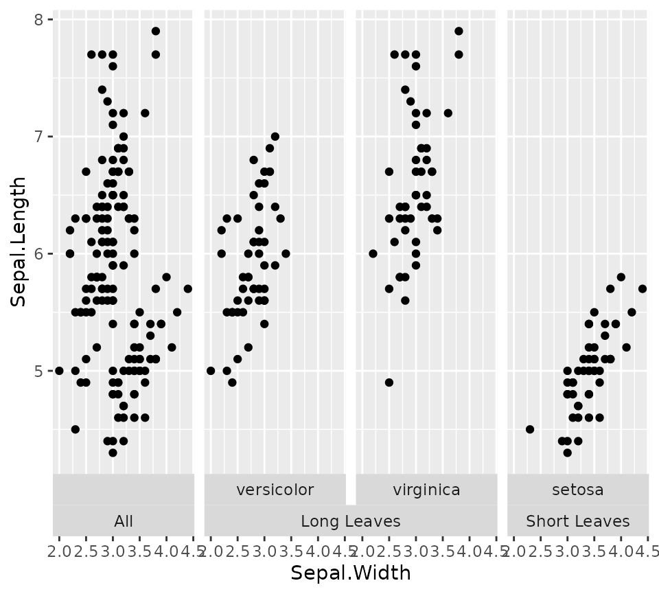
Variant for facet_wrap()
A similar variant exists for wrapping in facets. It can span the
strips for every strip.position argument, and has a few
nifty tricks for duplicating the axes or just the axis ticks.
p +
  facet_nested_wrap(
    vars(cyl, drv), dir = "v", strip.position = "left",
    axes = "all", remove_labels = "x"
  ) +
  theme(strip.placement = "outside")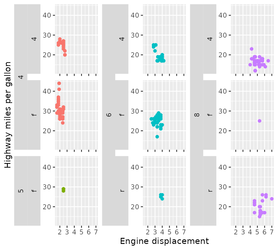
Please note that facet_nested_wrap() does not change the
underlying layout strategy of ggplot2::facet_wrap(). It
does not split sets to separate rows or columns. If you have
need of this type of custom layout, read on what
facet_manual() can do!
Manual facets
Before discussing manual facets, let me first explain the motivation behind it.
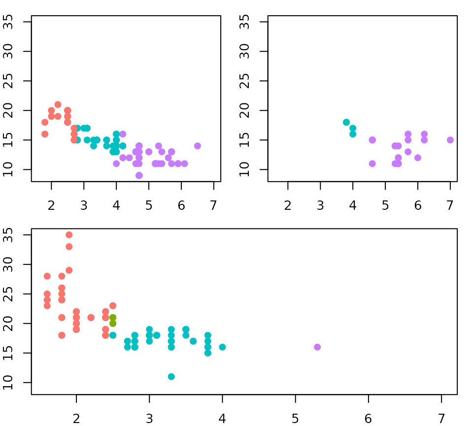
The base-R layout() function
The ‘grid’ and ‘wrap’ layouts of facets are great because they
dynamically adapt based on the available data. However, these layouts
come with the limitation that every panel occupies a cell in a grid, and
we lose some control over where data is drawn. A base R graphics
equivalent to set-up multi-panel figures is the layout()
function. A neat property of this function is that a single plot can
occupy more than one cell in a grid.
# Setting up a design for a layout
design <- matrix(c(1,2,3,2), 2, 2)
layout(design)
par(mar = c(2,2,1,1))

# Making a multi-panel plot based on the layout
df <- mpg
df$colours <- with(df, match(cyl, sort(unique(cyl))))
df$colours <- scales::hue_pal()(4)[df$colours]
splitted <- split(df, df$drv)
xlim <- range(df$displ)
ylim <- range(df$cty)
for (i in seq_along(splitted)) {
  with(splitted[[i]], plot(displ, cty, col = colours, pch = 19,
                           xlim = xlim, ylim = ylim, ))
}
The design argument
To achieve a similar level of control over ggplot2 facets,
facet_manual() was brought into life. Like the
layout() function, facet_manual() requires a
pre-specified design of which panels go where. I’ve called these
‘manual’ facets, because it doesn’t dynamically generate a layout based
on the available data, like the grid and wrap facets do. The matrix that
we had given to the layout() function in the plots above,
can now be used as the design argument for the manual
facets.
# Use design from previous chunk
p + facet_manual(vars(factor(drv)), design = design)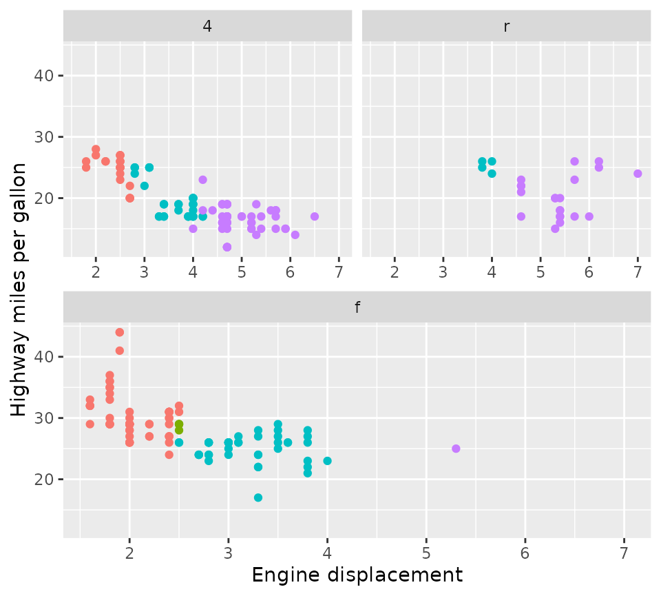
An alternative way of specifying the design is using a character
string. The approach to this was inspired by the design
argument in the patchwork::plot_layout() function that lets
you set columns by using subsequent characters, and set rows by using
new lines. Empty cells can be indicated with the
#-sign.
design <- "
  A##
  AB#
  #BC
  ##C
"
p + facet_manual(vars(drv), design = design)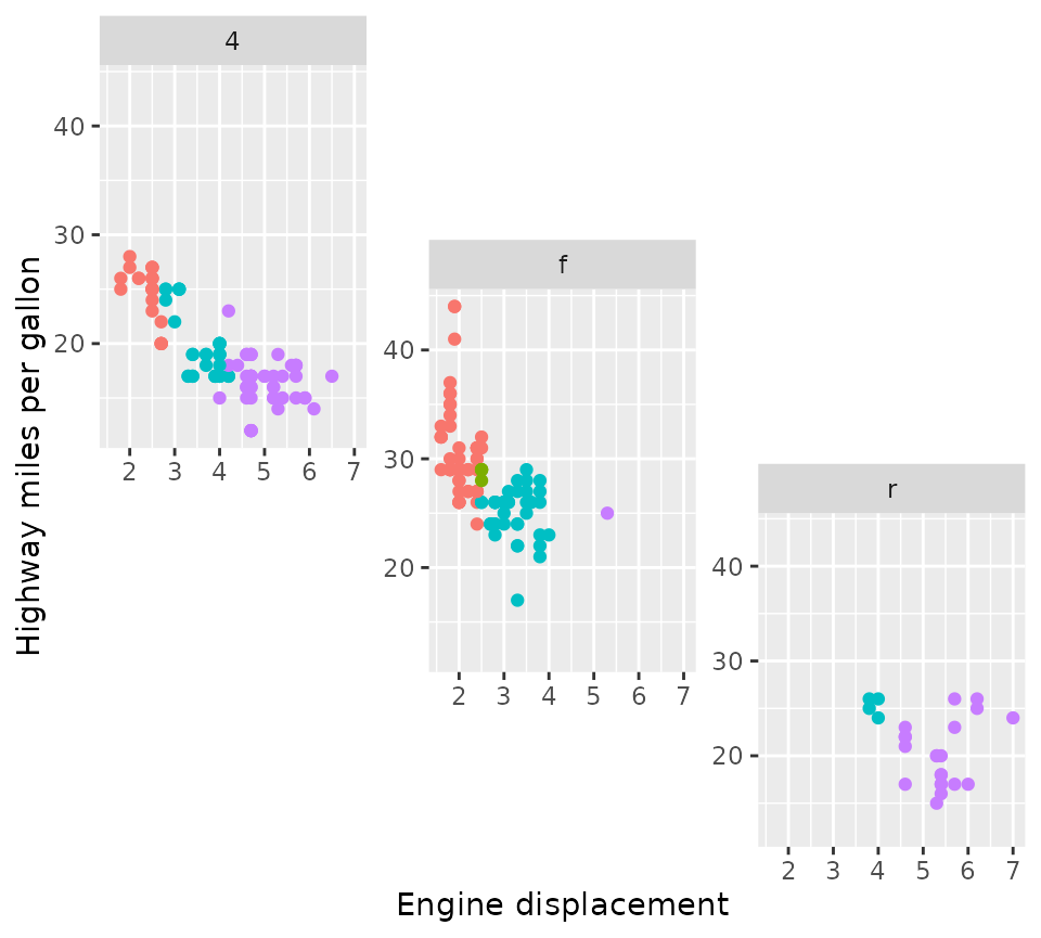
Placement rules
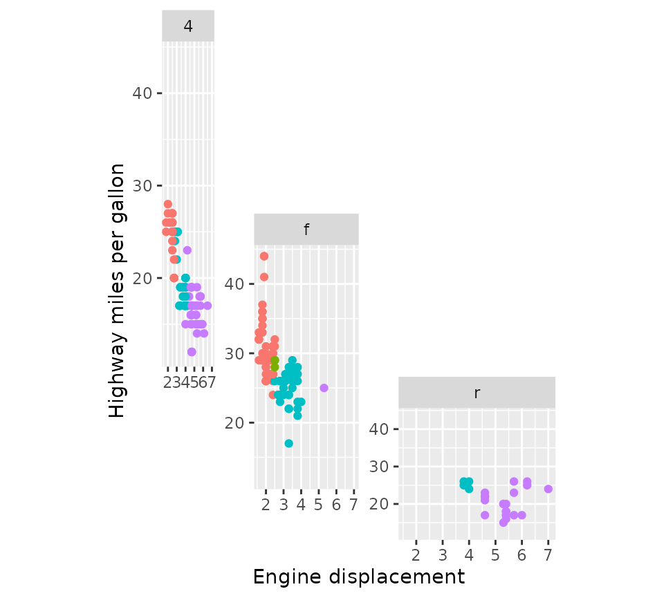
The facet_manual() function has the heights
and widths arguments that can be used to set the sizes of
rows and columns of the design. In the example below, we’re using
integers for the heights argument to specify relative sizes
and grid::units for the widths argument to set
absolute sizes. These arguments apply to the cells where the panels are
drawn. Therefore, the eventual size of a multi-cell panel is likely not
the exact sum of cell sizes, because facet_manual() makes
room for plot decorations like strips and axes. In the example below,
the height of the 4 wheel drive (4) panel is not exactly 3 + 2 = 5
relative units, due to the room that had to be made to fit the x-axis of
the front-wheel drive (f) panel and the strip of the rear-wheel drive
(r) panel.
p + facet_manual(
  vars(drv), design = design,
  heights = 4:1, widths = unit(1:3, "cm")
)
The panels above all share the same axes ranges, but because these
are drawn in a staggered fashion they should all be displayed. Because
there are only limited constraints of where axes can be placed, it is
hard to decide what duplicated axes are OK to omit. The manual facets
are not ‘smart’ enough to figure this out exactly and just draw the axes
for every panel, regardless of whether they are fixed or free. The only
exception to this rule, is when all panel occupies exactly 1
cell in the horizontal or vertical direction. Because of this, the
remove_labels and axes arguments are trickier
to use for facet_manual(), and may only be applied when the
criterion above is met.
A word of warning
The manual facets are ‘dumb’ in the sense that they don’t protect you
against ‘illegal’ layouts. If you specify non-rectangular areas in the
design argument, it will simply calculate the range of rows
and columns a panel will occupy, which can lead to (partially)
overlapping panels. It is up to the user to decide what is right in
these cases and the facets are not prohibitive.
design <- "
  AA#
  ACB
  #BB
"
p + facet_manual(vars(drv), design = design)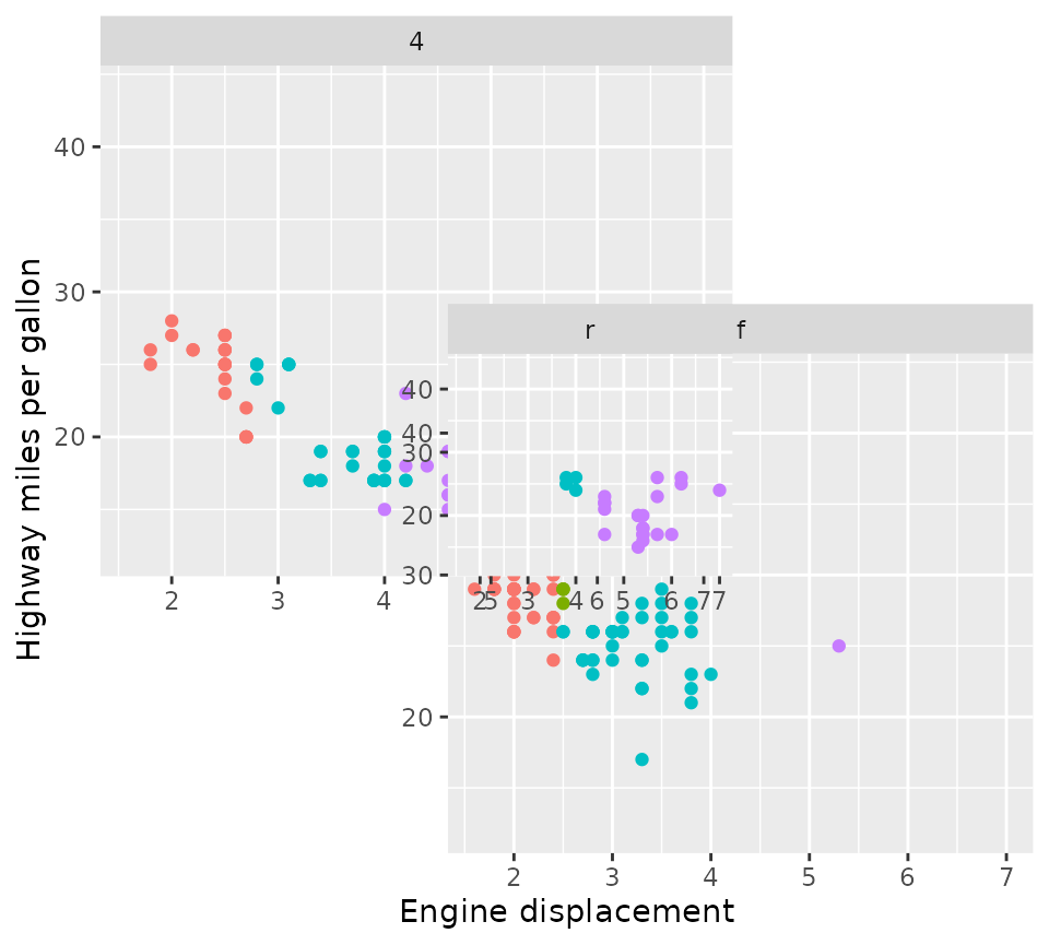
Strips
Strips are an important part of facets because they indicate what
small multiple of data is displayed where. In ggplot2, strips are
married to the facet functions, which control what is rendered how and
where they are placed. For facet functions in ggh4x, strips are divorced
from facets and strips are allowed to decide how they are rendered and
where they are placed. All ggh4x facetting functions have gained the
strip argument that take a new Strip class
that can constructed with the strip_*() family of
functions.
Vanilla strips
A style of strips that most closely resembles strips in ggplot2 are
vanilla strips that can be constructed using the
strip_vanilla() function. It is the default strip for
facet_grid2(), facet_wrap2() and
facet_manual(). Their behaviour mirrors the behaviour of
ggplot2’s strips by default, but they come with two extra arguments.
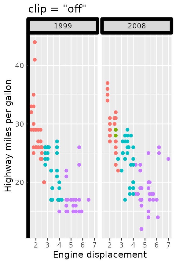
The clip argument controls whether the content of the
strip is clipped to the boundaries of the strip background. When
clipping is on (the default), any line-width applied to the strip
background is effectively halved in size and near impossible to get
nicely aligned with, for example, axis lines. When clipping is off, the
strip backgrounds have their full line-widths, and strip text is allowed
to exceed the confines of the background.
p2 <- p +
  theme(strip.background = element_rect(colour = "black", linewidth = 2),
        axis.line.y = element_line(colour = "black", linewidth = 2))

p2 + facet_wrap2(vars(year), strip = strip_vanilla(clip = "on")) +
  ggtitle('clip = "on"')

p2 + facet_wrap2(vars(year), strip = strip_vanilla(clip = "off")) +
  ggtitle('clip = "off"')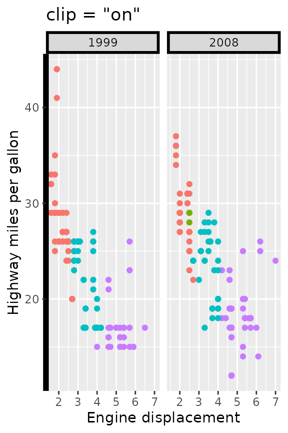
The second argument, size, controls how the size of
strips are calculated in the context of multi-layered strips. The
default, "constant", calculates a single size for every
layer. Normally, this makes everything looks tidy, but can become
awkward when longer labels are combined with shorter labels.
df <- data.frame(
  long = paste("A long title that is going to make the\n",
               "smaller title take up too much space"),
  short = LETTERS[1:3],
  x = 1:3, y = 1:3
)
p2 <- ggplot(df, aes(x, y)) +
  geom_point() +
  theme(strip.text.y.left = element_text(angle = 0),
        strip.placement = "outside",
        plot.title.position = "plot")

p2 + facet_grid2(long + short ~ ., switch = "y",
                strip = strip_vanilla(size = "constant")) +
  ggtitle('size = "constant"')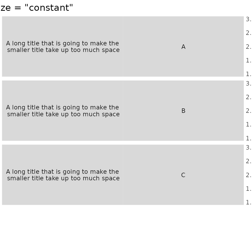
Setting size = "variable" instead shrinks excessive
spacing from strips on a per-layer basis.
p2 + facet_grid2(long + short ~ ., switch = "y",
                strip = strip_vanilla(size = "variable")) +
  ggtitle('size = "variable"')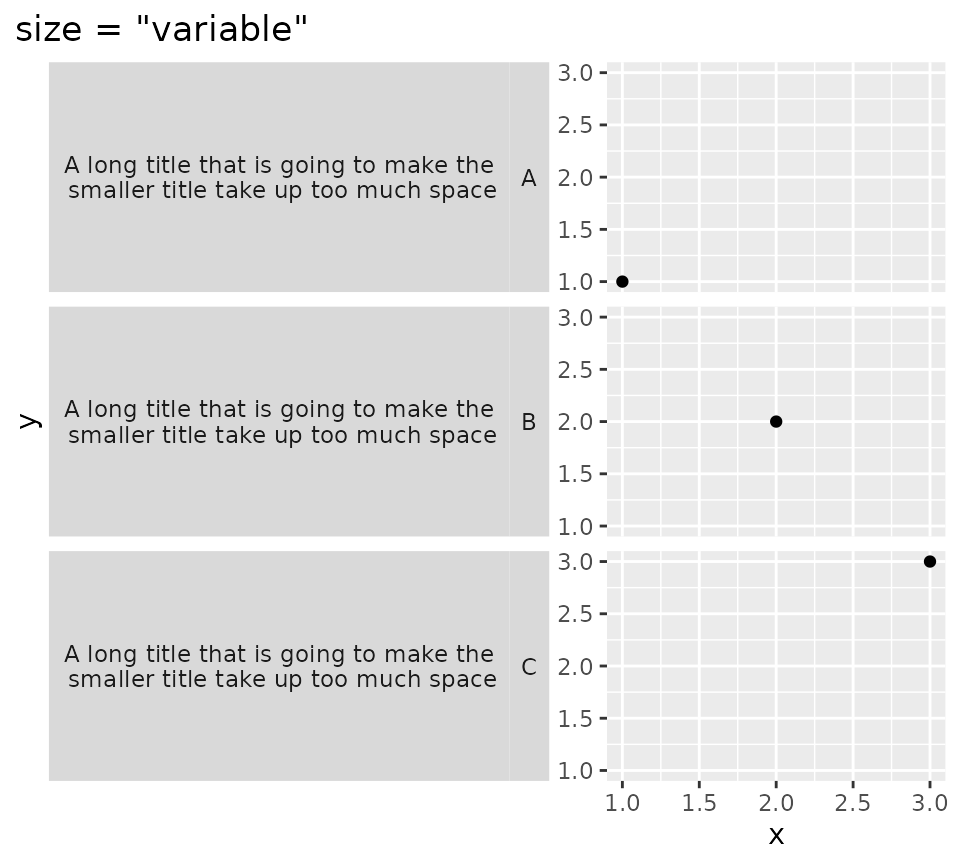
Themed strips
An extension of the vanilla strips is themed strips. In addition to
the clip and size arguments, these strips
allow you to set the strip.text.* and
strip.background.* theme settings on a per-label or
per-layer basis. The background_x/y and
text_x/y arguments accept a list of ggplot2 theme elements.
If the number of theme elements does not fit the number of strips, the
theme elements will be expanded with rep_len() as shown
with the vertical strips below.
It can be a bit of a pain to construct a list of elements per the
following:
list(element_text(colour = "dodgerblue", face = "bold), element_text(colour = "limegreen", face = "bold)).
Instead, there are convenience functions that let you get the exact same
results by using
elem_list_text(colour = c("dodgerblue", "limegreen"), face = c("bold", "bold")),
which is slightly less verbose. There is also a
elem_list_rect() function to do the same for
element_rect().
ridiculous_strips <- strip_themed(
     # Horizontal strips
     background_x = elem_list_rect(fill = c("limegreen", "dodgerblue")),
     text_x = elem_list_text(colour = c("dodgerblue", "limegreen"),
                             face = c("bold", "bold")),
     by_layer_x = TRUE,
     # Vertical strips
     background_y = elem_list_rect(
       fill = c("gold", "tomato", "deepskyblue")
     ),
     text_y = elem_list_text(angle = c(0, 90)),
     by_layer_y = FALSE
)

p + facet_grid2(class ~ drv + year, strip = ridiculous_strips)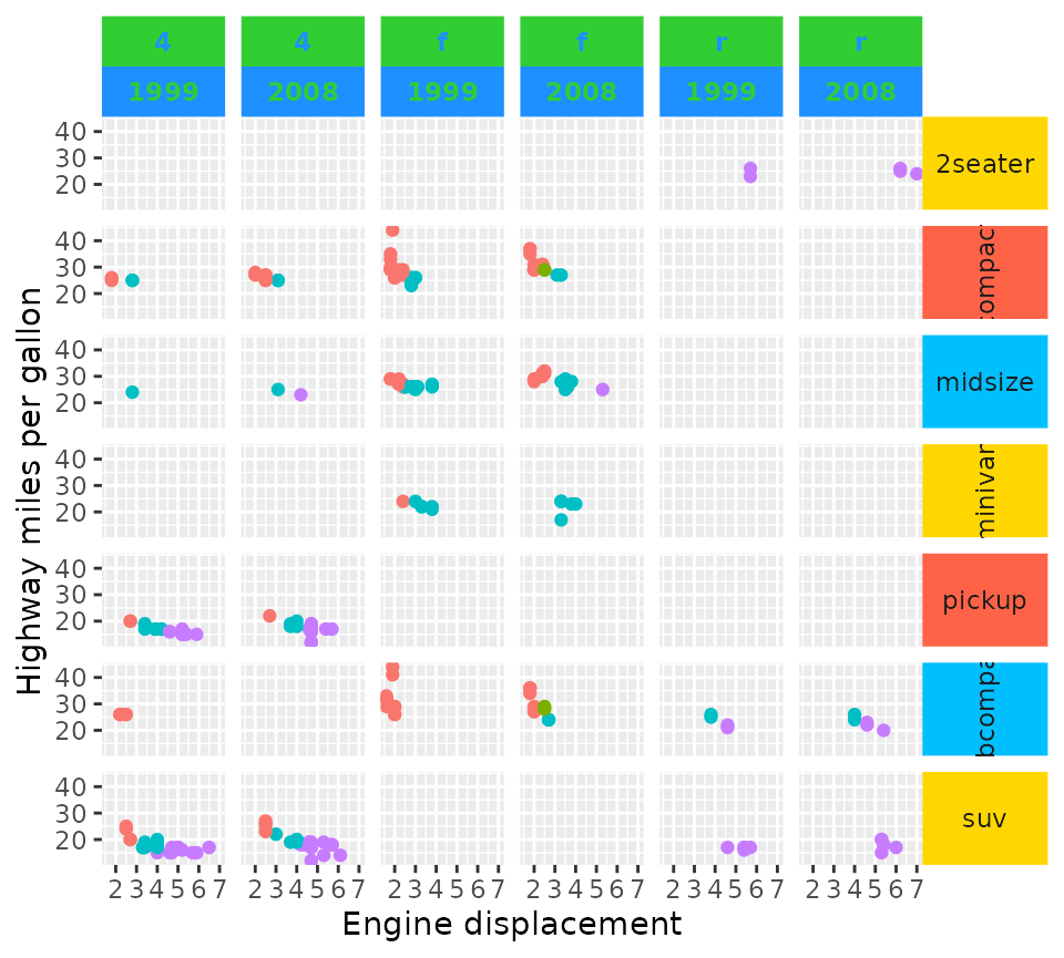
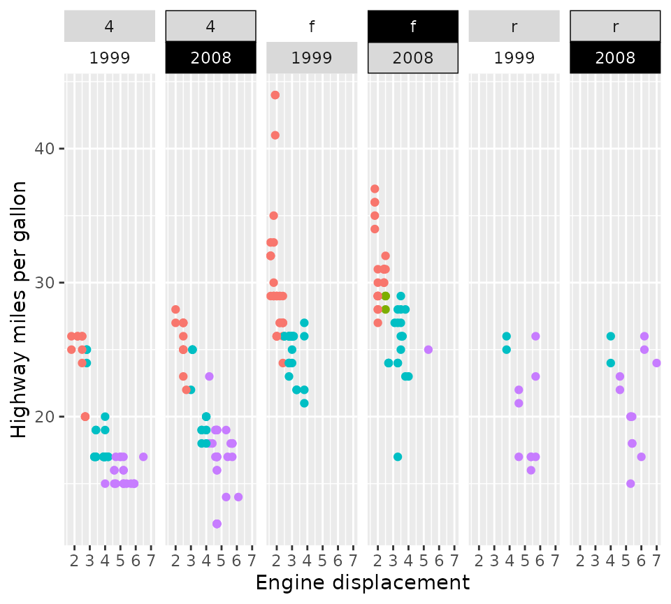
The list of elements does not need to be a homogeneous list of the
same type of elements. You can use NULL to inherit directly
from the theme, and element_blank() to skip drawing the
element. The themed strips should in theory also accept
extended theme elements -it accepts for example
ggtext::element_markdown()- provided that the
implementation has a element_grob() method and the
resulting graphical objects communicate their size appropriately. The
constraints are similar to the constraints in theme(): text
elements should inherit from element_text and background
elements should inherit from element_rect.
p + facet_grid2(
   . ~ drv + year,
   strip = strip_themed(
     background_x = list(NULL, element_rect(colour = "black"), element_blank(),
                         element_rect(fill = "black")),
     text_x = list(NULL, NULL, NULL, element_text(colour = "white"))
   )
)
Nested strips
The crux of nested strips has already been introduced in nested_facets: they merge strips that have the
same labels at the same height. They are the default strips in
facet_nested() and facet_nested_wrap() and
they are constructed using strip_nested(). There is nothing
special that makes these facets more suitable for strips, and you can
use nested strips in facet_grid2(),
facet_wrap2() and facet_manual() too. Because
the nested strips are based on strip_themed(), the
appearance of strips can be tweaked in the same way. The nested strips
only have one extra argument, bleed, that controls whether
lower layer nested strips are allowed to merge when higher layer nested
strips are different. In the example below, you can see in the 2nd and
3rd panels that the two “f” labels aren’t merged because higher strips
are different (“4”and “5”).
p + facet_wrap2(
  vars(cyl, drv), ncol = 4,
  strip = strip_nested(bleed = FALSE)
) +
  ggtitle('bleed = FALSE')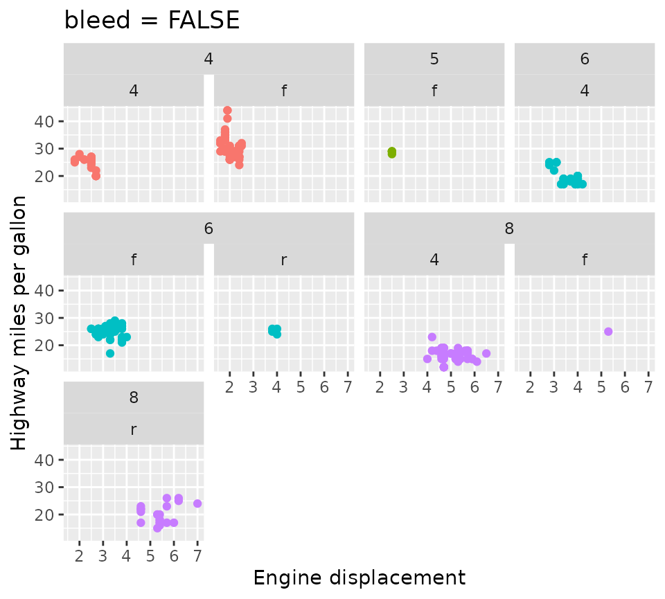
In contrast, when bleed = TRUE, lower layer strips are
allowed to ‘bleed’ into one another even though the higher level strips
are different. In the example below, you can see that the “f” strips of
the 2nd and 3rd panel have merged, even though they have different
labels (“4” and “5”) in higher layer strips.
p + facet_wrap2(
  vars(cyl, drv), ncol = 4,
  strip = strip_nested(bleed = TRUE)
) +
  ggtitle("bleed = TRUE")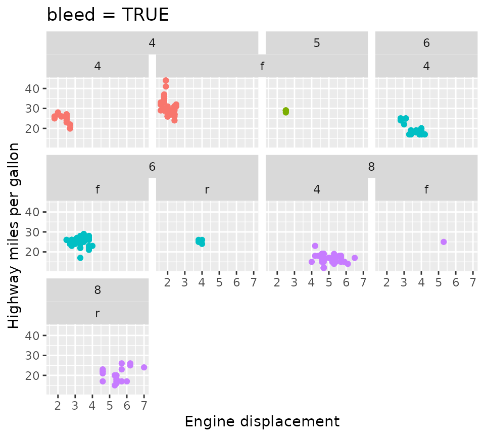
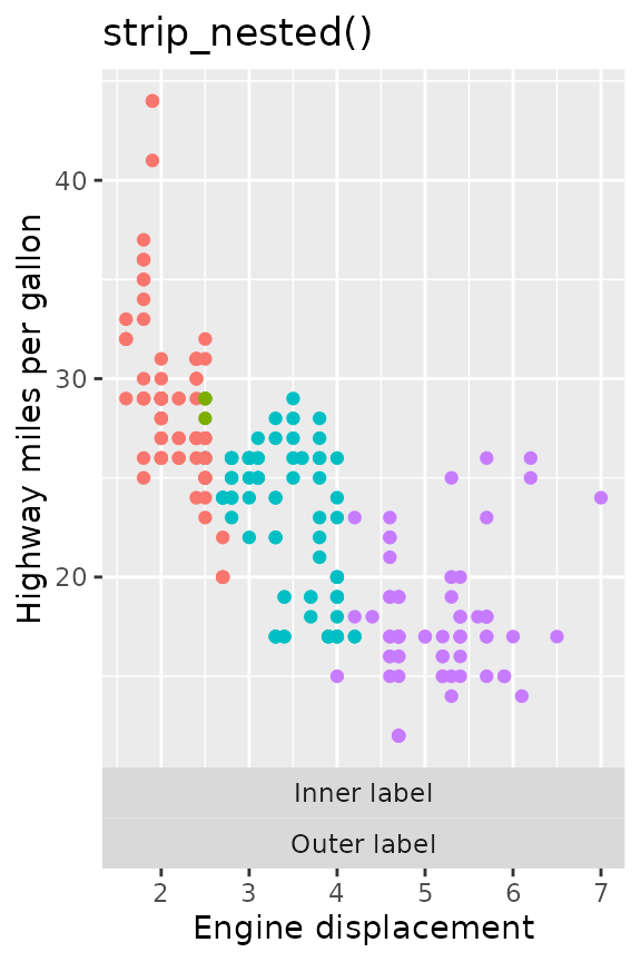
Another difference between strip_nested() and other
strips, is that the ordering of the layers is always such that the inner
layers are closer to the panels than the outer layers. It felt like the
right decision because if we’re trying to distinguish hierarchies, it
sense to place the more fine-grained hierarchy closer to the data that
is a member of that hierarchy.
p + facet_grid2(
  cols = vars("Outer label", "Inner label"),
  switch = "x", strip = strip_vanilla()
) +
  ggtitle("strip_vanilla()")

p + facet_grid2(
  cols = vars("Outer label", "Inner label"),
  switch = "x", strip = strip_nested()
) +
  ggtitle("strip_nested()")
Position scales
Another thing we might want to tweak about facets is the exact
specifications of each facet’s position scale. To set the scales
individually, we can use facetted_pos_scales() in
combination with a list of scales. This way, you can vary labels,
breaks, limits, transformations and even axis guides for each panel
individually.
Lists of scales
The list of scales follows the order of the facets, as long as they
are set to ‘free’. Tweaking the position scales works with many types of
facets, such as wrap, grid and nested, but has to be called
after facets are added. If you don’t want the scales to be
free, you can use the xlim() and ylim()
functions to fix the limits, but the facetted_pos_scales()
function requires the scales argument in a facet to be
"free" in order to apply the different scales.
scales <- list(
  scale_x_reverse(),
  scale_x_continuous(labels = scales::dollar,
                     minor_breaks = c(2.5, 4.5)),
  scale_x_continuous(breaks = c(2.945, 6),
                     limits = c(0, 10),
                     guide = guide_axis(minor.ticks = TRUE))
)

p + facet_wrap(vars(drv), scales = "free_x") +
  facetted_pos_scales(x = scales)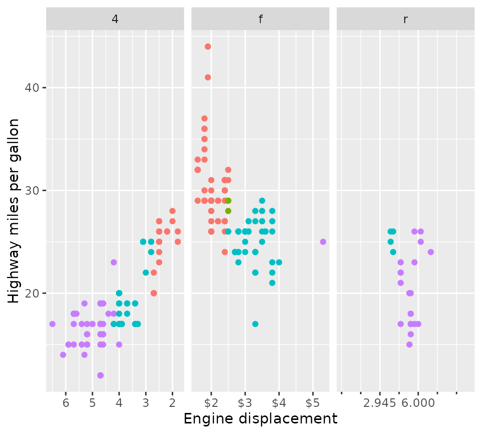
Formula notation
Because it might be inconvenient to predict in programmatically which
data might end up in what position, there is also an option to use
two-sided formulas to set scales by panel. The formula notation is
inspired by dplyr::case_when() and lets you use the left
hand side (LHS) to decide where to apply scales, and the right
hand side (RHS) to decide what scales to apply. The LHS of the
formula will be evaluated in the context of the plot’s layout. This is
an internal structure that (for good reasons) isn’t normally exposed, so
it requires a bit of knowledge to know what can be used. For most
facets, the plot layout is a data.frame that contains the
COL, ROW and PANEL columns that
keep track of what panel goes where in the grid of cells. In addition,
it contains the faceting variables, such as class in the
example below.
red_axis <- guide_axis(theme = theme(
  axis.text = element_text(colour = "red"),
  axis.ticks = element_line(colour = "red")
))

p +
  facet_wrap(vars(class), nrow = 1, scales = "free_x") +
  xlim(range(mpg$displ)) +
  facetted_pos_scales(x = list(
    COL %% 2 == 0 ~ scale_x_continuous(labels = NULL, limits = xlim),
    class %in% c("midsize", "suv", "subcompact") ~ scale_x_continuous(
      guide = red_axis,
      limits = xlim
    )
  ))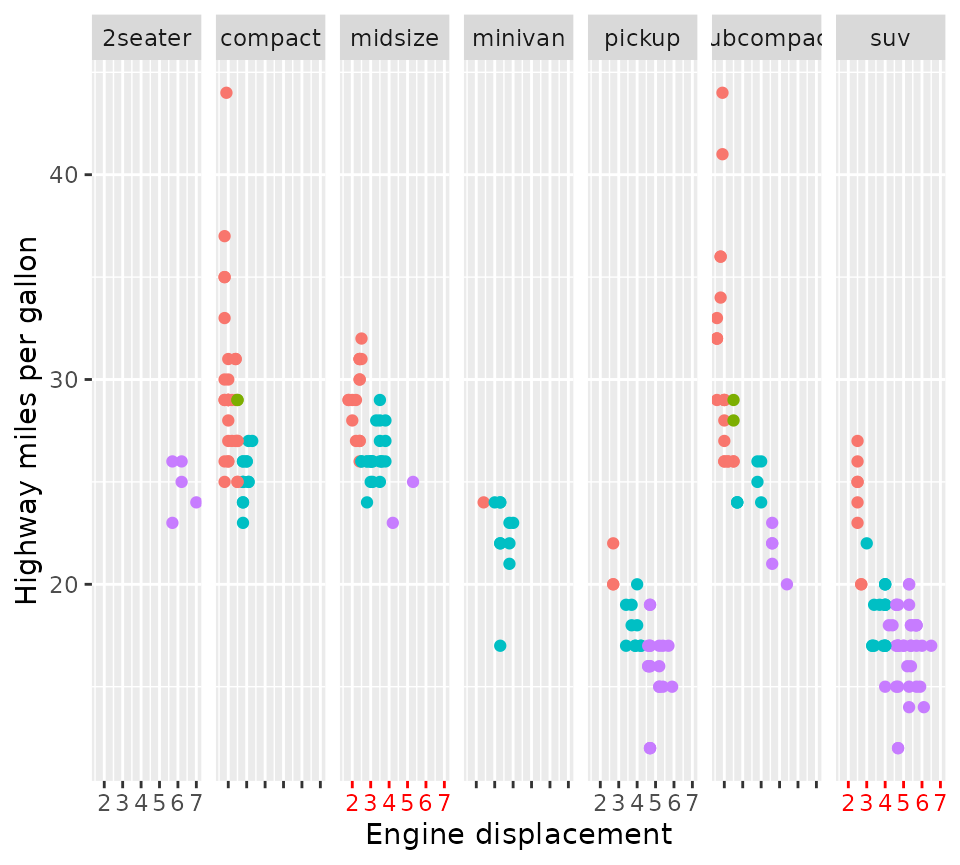
In the example above, we removed the label from every even column by
using COL %% 2 == 0, wherein COL is a column
in the aforementioned layout structure. We also made the axes of the
"midsize" and "suv" classes red. The reason we
don’t see red axis ticks in the "subcompact" panel is that
applying scales is prioritised based on the order of formulas. Because
the "subcompact" panel is also on an even column, and the
‘even columns have no labels’-formula was first, it gets excluded from
the second formula.
Convenience notation
If you prefer the regular syntax of ‘adding’ components to a plot,
you can also get the results above by using
scale_x_facet(). Instead of providing a two sided formula,
the first argument (expr) takes an expression that is
evaluated in the context of the layout structure. To get the equivalents
of, for example, scale_x_log10(),
scale_x_reverse() or scale_x_date(), you can
provide type = "log10", type = "reverse" and
type = "date" respectively.
p +
  facet_wrap(vars(class), nrow = 1, scales = "free_x") +
  xlim(range(mpg$displ)) +
  scale_x_facet(
    COL %% 2 == 0,
    labels = NULL, limits = xlim
  ) +
  scale_x_facet(
    class %in% c("midsize", "suv", "subcompact"),
    limits = xlim,
    guide = red_axis
  )
Interaction with stats
The facetted_pos_scales() works because it makes an edit
to the facet, which comes with an important limitation. Due to the way
plots are build and when facets are involved, scale
transformations are applied after calculations in the stat part
of the layer. This differs from normal behaviour, where scale
transformations are applied before stat calculations.
Therefore, it is recommended to pre-transform the data in layers with
non-identity statistics in the aes() mapping. An example of
what could go wrong is shown below.
set.seed(0)
df <- data.frame(
  x = rlnorm(100, 10)
)

# Normally data is transformed prior to stat calculations
ggplot(df, aes(x)) +
  geom_density() +
  scale_x_log10() +
  ggtitle("standard log10 scale")

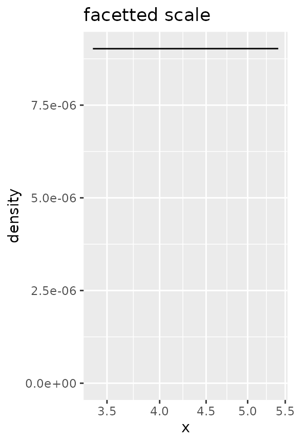
# This can give problems when combining stat calculations with facetted
# position scale transformations.
ggplot(df, aes(x)) +
  geom_density() +
  facetted_pos_scales(x = list(scale_x_log10())) +
  ggtitle("facetted scale")

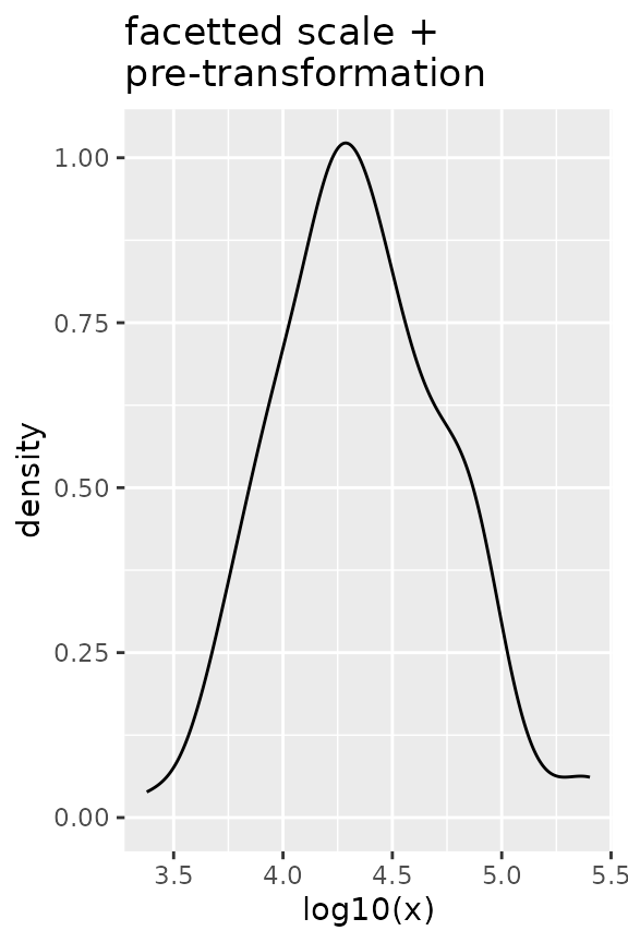
# Pre-transformed data
ggplot(df, aes(log10(x))) +
  geom_density() +
  facetted_pos_scales(x = list(scale_x_continuous())) +
  ggtitle("facetted scale +\npre-transformation")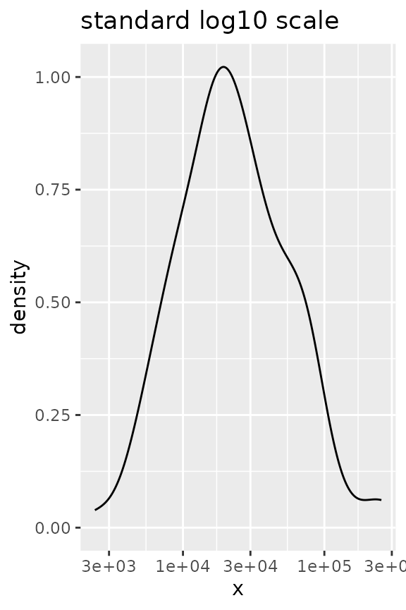
Panel sizes
Lastly, we can also set the sizes of the panels to what we want. The
function force_panelsizes() can let you set relative or
absolute sizes for the rows and columns. The function should be
applicable to facets that follow typical ggplot2 conventions. That
includes, but is not limited to, the facet functions in ‘ggplot2’, those
in the ‘ggforce’ package, those in ‘ggh4x’ and possibly others (it’s
redundant for facet_manual() though). Notably, it also
applies to facet_null(), the default facet in every
plot.
p + force_panelsizes(rows = unit(2, "cm"), cols = unit(2, "in"))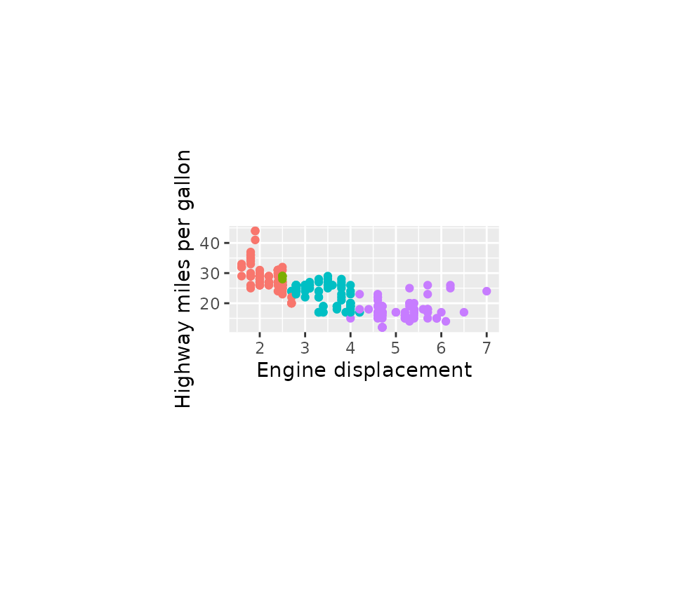
The settings overrule the coordinates’ or theme’s aspect ratio and
space = "free" facet arguments. By default, rows and
columns are set relative within themselves only. When
respect = TRUE, the rows and columns relative units become
also relative between rows and columns, as you can see in the plot
below. Alternatively, you can set them as absolute units with the
grid::unit() function. Again, these need to be added
after any facets.
lvls <- factor(c("Points", "Density"), c("Points", "Density"))
g <- ggplot(faithful) +
  geom_point(aes(waiting, eruptions),
             data = ~ cbind(.x, facet = lvls[1])) +
  geom_density(aes(y = eruptions),
               data = ~ cbind(faithful, facet = lvls[2])) +
  facet_grid(~ facet, scales = "free_x")

g + force_panelsizes(cols = c(1, 0.3), rows = c(0.5), respect = TRUE)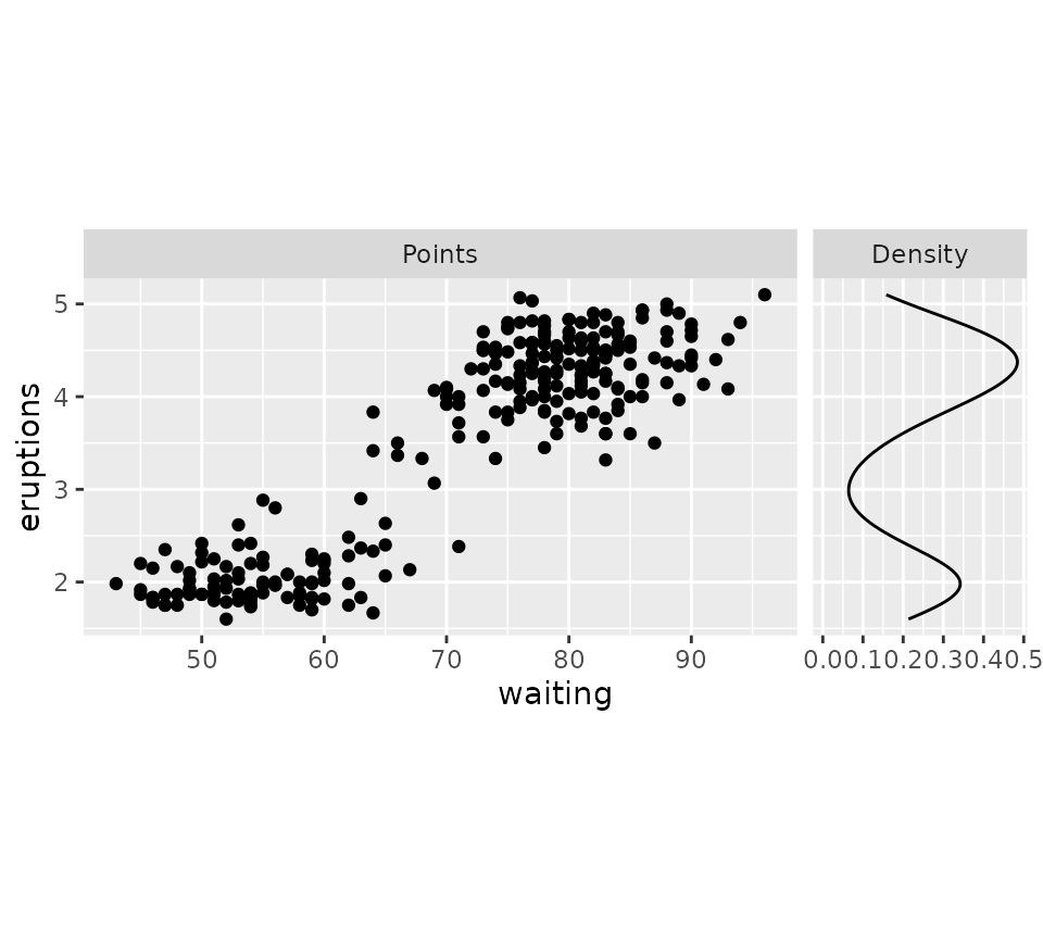
Another option is that we can set relative units and use the
total_width and total_height to set the
dimensions of the whole panel area in absolute units. This ‘whole panel
area’ does not include axes or strips on the outside of the plot, but
does include panel spacing and axes in between panels.
g <- g + force_panelsizes(
  cols = c(1, 0.3), total_width = unit(6, "cm"),
  total_height = unit(4, "cm")
)
g
If you think the breaks of the density plot above are too packed, why
not tweak these with scale_{x/y}_facet()?
g + scale_x_facet(facet == "Density", breaks = c(0, 0.2, 0.4))