As you may have noticed from my deluge of posts across the past year: it has been a while for one of these. This time around, I’m swinging by to announce that legendry 0.3.0 has nestled itself on CRAN! I’ll be going over some of the new stuff, and some old stuff that is accruing in legendry. I’ll not wax poetically about all of them, so let’s quickly go to the plotting bits of the post.
Side plot
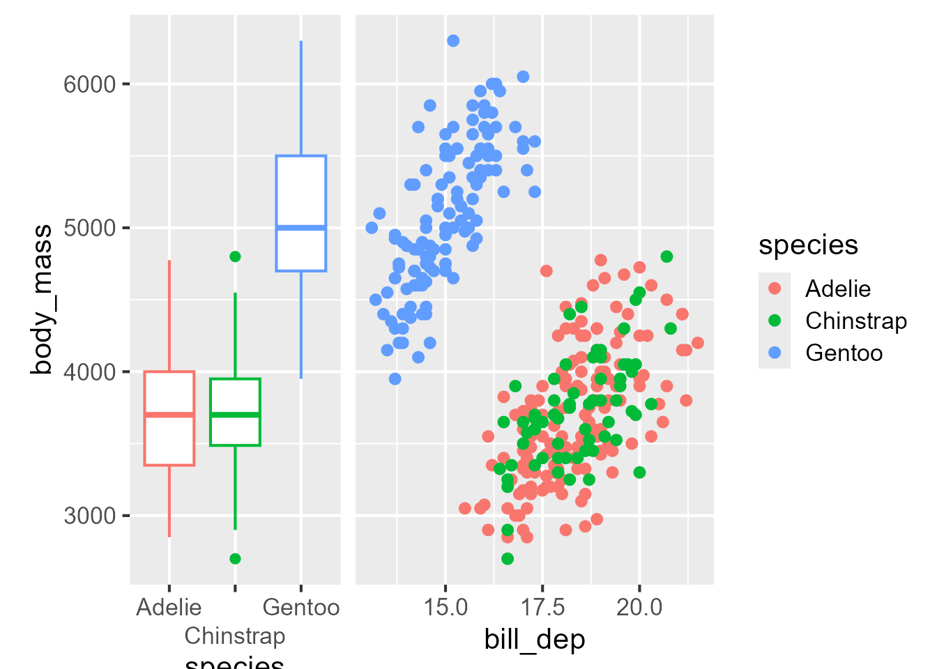
Arriving at the truly new stuff, the is now guide_axis_plot(). The main thing the guide does is trying to harmonise the shared axes.
If you had noticed ‘hey, that looks what the ggside package is doing’, then you observe sharply. The main difference is that ggside has luxurious geometries, scales and layout management that make it all come together nicely. In contrast guide_axis_plot() is limited by what fits into a guide, and may misalign things outside the panel area; like titles in the side plot, or long axis labels. But, it does not depend on anybody implementing geometries or scales for it, so there is a little bit of freedom in that.
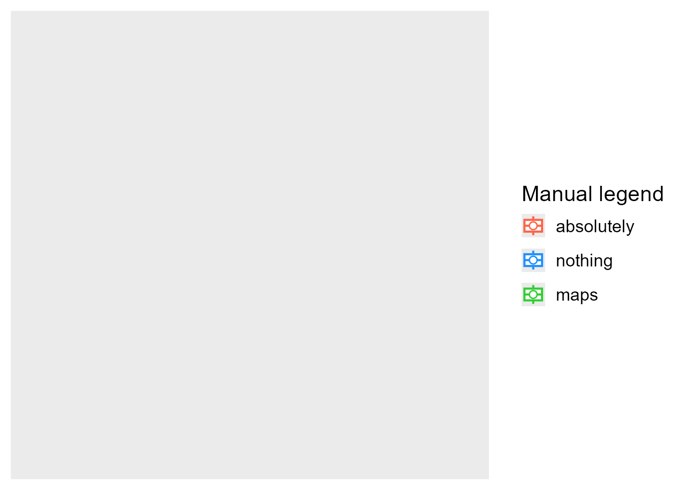
Manual legend
It is an awkward position to make something and hope people won’t use it. I highly recommend you not use the next guide. Do the right thing and map your data correctly, I promise it is better that way. This guide is only for those moments when you’re pulling out your hair in trying to submit a legend to your will. The guide is guide_legend_manual(). It requires no (plot) layers. It requires no scales. Just the abandonment of sanity. You can tweak a whole bunch of things, like the aesthetics, what kind of layer are displayed, the usual theme settings. Essentially it is the override.aes+ of guides. Use it just to spare your scalp.
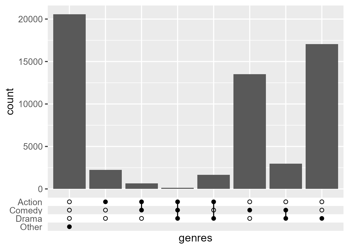
I’ve always found the graphical idiom of the ‘upset plot’ aptly named.1 Not because it levels up display of sets, but because it upsets me. The best thing about upset plots, is that they are slightly less bad than Venn/Euler diagrams.
Code
# Pardon me the gnarly pre-processingdf <- ggplot2movies::moviesgenres <-as.data.frame(lapply(setNames(nm =c("Action", "Comedy", "Drama")), function(i) {ifelse(df[[i]] ==1, i, "") }))df$genres <-apply(genres, 1, function(x) {paste(x[nzchar(x)], collapse =",")})ggplot(df, aes(genres)) +geom_bar() +guides(x ="axis_upset")
You might think: ‘hey this looks a lot like ggupset/UpsetR/ComplexUpset and others’, and once again: you’d observe sharply. The main thing is that implementing it as a guide doesn’t pidgeonhole your visualisation on other fronts. It doesn’t commit you to using specific geometries, particular scales scales or other systems.
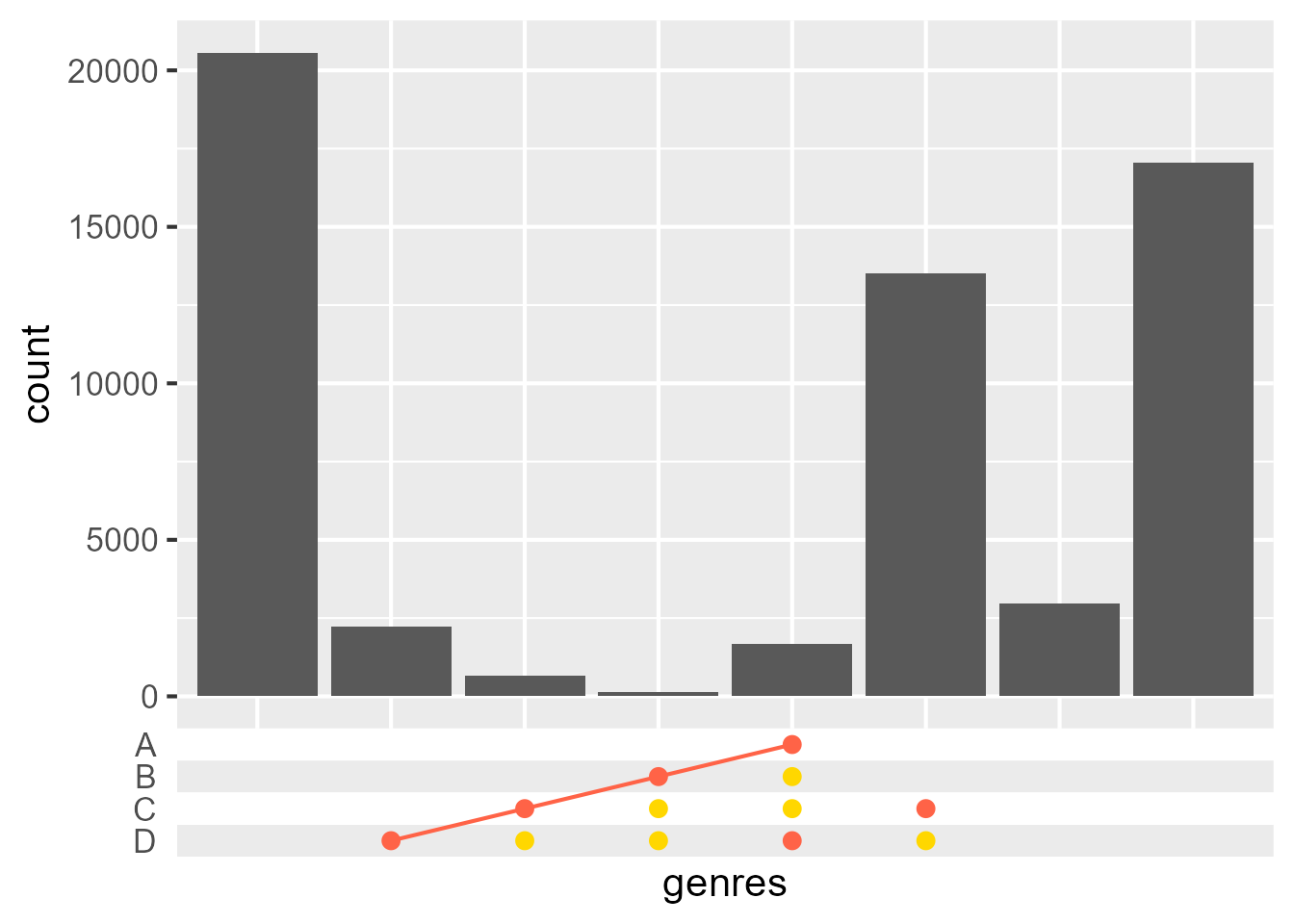
The main reason I wanted it though was it’s sister guide: guide_axis_symbols(). This is like a combination matrix of upset guides, but not even constrained by combinations. If I want to display my winning ‘connect four’ positions underneath my plot, I will.
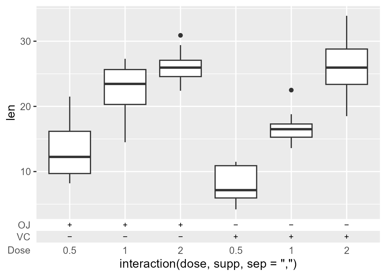
While not very great for automatically inferring things from the scale, it does open up some possibilities. Here we can nail that classic ‘biomedical sciences look’ by using + and − to denote absence/presence of compounds.
Having indulged ourselves in all this wickedness, let’s get back down to earth. The guide_axis_annotation() function is a straightforward annotation function. It places extra labels at indicated positions. When in a primary position (bottom, left), it retains the regular axis and pops out beyond their labels. When in a secondary position, it is just the ticks and labels. It has convenience wrapper for the 4 standard positions: annotate_top/right/bottom/left().
One of the reasons I’ve build this annotation tool is because Stephan Edwards mentioned he aimed to retire the lemon package, and was discussing migrating lemon’s features to other packages. Since he build the original lemon::annotate_{x/y}_axis() functions, ggplot2’s guide system has moved forward. For that reason, I thought a legendry-flavoured re-implementation should use the modern tools available.
Key settings
This release, I’ve added some options to many keys to style their breaks. The premise is pretty simple, you can set options in the key functions, like colour, linewidth etc. When setting manual keys, you can have them in parallel to your breaks. But also for non-manual keys, you can use for styling. Graphical parameters that are shared between theme elements can be set distinctly. You can for example use text_colour which only applies to labels or line_linewidth which applies to lines, but not rectangles.